|
Backdrops R Us
by Andrew Korn
[Ed. This month, Andrew Korn gives us his picks for the
Community Exchange Workbench Backdrops competition. Click on any of the
thumbnails to download the associated backdrop]
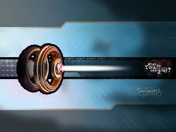 Amiwall001 by DJNick Amiwall001 by DJNick
I've been a fan DJNick's work ever since he sent a few
pieces for inclusion in the Gallery section of CU Amiga back when I was
collating that. DJNick - known to unimaginative passport issuing
authorities as Nikola Tomic - has a strong graphic sense that is
apparent in all four of the pictures he sent in for the competition.
Amiwall4 ran this one very close in my selection, and to be honest I
was tempted to pick both but decided to limit myself to one choice from
each artist. This one gets the nod - just - because it works better at
filling the design brief of being a Workbench backdrop.
Both Amiwall001 and Amiwall4 have a central graphic that
combines the archetypal Amiga boing-ball with an abstract form that
hints at creativity, graphics, and function. The golden cog-like wheels
and strong horizontal lines make this a nicely dynamic composition, but
without getting too "busy". The bold black outlines match the OS4
graphical sensibility nicely, although some people might find the
overall effect a little strong for their tastes. I do somewhat prefer
the subtler central design of Amiwall4, but I feel this overall design
makes for a cleaner backdrop, and the horizontal divisions can be used
to include icon layout in the total visual composition. I'm not
convinced by the "what do You wanna use 2day" slogan, but it's less
confusing that "what/where/who/is your pFUTURe" slogan in Amiwall4
("pfuture?"), and the more complex graphical content in that image is
more appropriate to cover artwork or advertising material than a
Workbench backdrop.
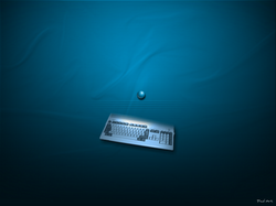 Blue Nostalgia by PixelArt/Jean-Yves Auger Blue Nostalgia by PixelArt/Jean-Yves Auger
Some people might question the use of backwards-looking
A1200 nostalgia in a backdrop image for the brand new OS, but it's as
important to pay attention to where we've come from as where we're
going - and presumably some people will be running OS4 on their
souped-up A1200s anyway.
This piece attracted my attention largely because of its
understated simplicity. There's a big fashion in design circles to use
text as texture, but there's always a danger of making an image
over-complex with this approach, and for a Workbench backdrop
simplicity has many benefits. The image used as a backdrop should
always be clearly differentiated from the windows and icons that will
appear on top of it, and that's something this picture will manage
admirably.
The artist, who goes by the name PixelArt, clearly has an
excellent understanding of the use of colour. The rather restful shades
of blue are given depth by the application of a subtle folded fabric
texture, and the image of the A1200 is cleverly blended with the
backdrop shade to avoid harsh discontinuities. The spotlight colour is
a near complementary of the background blue, which helps the A1200
image stand out without being too obvious. The blue-on-blue bubble and
horizontal lines (which I take to be the grill lines on the top of the
A1200) is a nice understated central motif, although annoyingly I'm
sure I've seen something very similar used in a logo before but can't
quite place it.
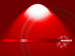 T-002-a by Jumpship T-002-a by Jumpship
Jumpship's blood-red tones and bright central highlight
certainly don't lack boldness. Many people would find this image too
strong to have staring out from their computer screens all day long,
and it will look a bit extreme with the default blue colour scheme of
OS4.0. Nevertheless this is an image which will produce minimal viewer
fatigue, and the separation between foreground and background certainly
won't be a problem.
Personally I'd have toned down the brightness of the
spotlight, but overall this is a pleasing image with a texture that
breaks up the harshness of the tone and is well laid-out, with the red
OS4 logo bar and boing ball breaking up the image plane without getting
over-fussy.
The saturation is a touch too overwhelming for me, and I
couldn't see myself picking this as a Workbench backdrop in the long
term, but I can see this making its way onto the desktops of many of
the more gothicly inclined Amiga users out there.
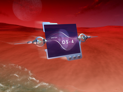 Red Skies by Jim McEwen Red Skies by Jim McEwen
Jim McEwen, presumably some very distant relative of
Amiga boss Bill of that ilk, is another fellow who likes his backdrops
red. In this case the red is a subtler tint, applied to a pleasing
landscape composite that reminds me somewhat of the poster design for
the movie Dune. The central image is a nice iconic reference to the
notion of futuristic computing. Its blue-purple tones help it stand out
nicely from the background, while a gentle motion blur stops it looking
too disconnected from it - with a background image it's important to
make sure everything seems to be a fundamental part of the background
rather than something sitting on top of it. You don't want confused
users trying to resize it after all!
The only thing I don't really like about this image is
the sea washing up across the bottom left corner of the image. The
green tones of the water contrast too strongly with the overall redness
and unbalance the image somewhat.
Red Skies also has the rare distinction of being created
on an Amiga One. Most of the initial image making was done with a
variety of packages on Jim's A1200, but the final composition was
constructed using The Gimp under Linux.
 Impulsive and Versatile by Thomas "Cojo" Veress Impulsive and Versatile by Thomas "Cojo" Veress
This is another case where I had a hard time choosing
between entries from one person. In this case probably the main reason
I prefer this one to Thomas' other piece, the amusingly titled "Waitin'
4", was the fact that the other one has a fake bar-code with the
characters "4M164 R00l5" written below it, and that's just too geeky
for me. Waitin' 4's swirled composition is very smart, but not quite
smart enough to compensate!
This piece benefits from a very nicely rendered stone
texture (I'm a sucker for a good stone texture) with an ideal tonal
balance to use as a backdrop. This one has a slightly warm cast which
makes the blue OS4 default theme recess slightly by comparison; warm
tones always tend to appear slightly "in front" of cooler tones. I'd be
inclined to add a very slight green cast, which would push it a little
more into the background without disrupting the texture too much. It
shows admirable restraint, always a bonus for a backdrop, and the text
and horizontal bar is applied as a tint over the texture which keeps it
nicely in the background. This design is also unique amongst current
entries, in my opinion, in that the text actually works well as a
message rather than just to supply visual texture - Thomas has used the
Roman numeral for of 4 as the initials of a slogan (and the title of
the piece), which is sharp and to the point.
The only thing about this image that I don't really like
is the boing ball image - the yellow glow is a touch too strong for my
taste, and Thomas has outrageously used far too few red checks! However
the Saturn-like rings and the radiating lines, which give it the
appearance of a compass rose, are a brilliant design touch.
|